Cable News Trending Topics for 2015-04-15
The #ObamaTownHall tag was the top trender in Cable News Twitter on Wednesday…
The #ObamaTownHall tag was the top trender in Cable News Twitter on Wednesday…
Let’s say you poll a random sample of 1,000 residents of Boston and New York City, each, about who they think the best football team is. You could expect a few to pick who they think will win the super bowl but, by and large, people in Boston will say “Patriots” while people in NYC will say either “Jets” or “Giants”. Nothing surprising there, and you really wouldn’t learn anything other than that people root for their home team.
Add up all the choices, and you’ll find that about 50% of the people you asked said Patriots (the 1,000 people you asked who are in Boston), about 30% said Giants, and 20% said Jets(1). No surprise, right?
So what do you tell people? Why, you tell people that “People in Boston and New York said that the Patriots are their favorite team”! Because, of course, in your poll, the Patriots came in first. And what would people say about your analysis? Well, in Boston, they’d say “of course, that’s right!” and you’d get a pat on the back (so to speak). In New York they would say “bite me” (or similar) and I hate to think what they’d do to you. Everywhere else they’d just call you an idiot for your analysis. And, to be fair, you’d actually be an idiot for making such a claim.
So it’s surprising, to say the least, to see that Quinnipiac University has become the source of just this kind of idiocy. They conducted a poll that asked people who the worst post-WW2 president is. And in this version, Boston, the republicans, overwhelmingly said “Obama”. And the New Yorkers, aka the democrats, split their worst-president vote between their two least-favorites: George W Bush and Richard Nixon.
And, so, Quinnipiac reports, breathlessly, that “Obama Is First As Worst President Since WWII”. Just like the Patriots are first as the favorite football team in Boston and New York City. It’s not really true except in a meaningless way, but it sure sounds shocking, and it is getting them a lot of publicity during an otherwise very quiet week.
It’s sad to see a major university stoop to clickbait headlines that suggest conclusions not supported by the data. But if all you really want is attention, that’s one way to get it…
(1) That 60/40 breakdown is a guestimate based upon some quick googling. If it’s wrong, it doesn’t affect the analysis. Nonetheless, I apologize to Jets fans unreservedly.
There’s no real insightful analysis to this, I just thought it was interesting and worth sharing:
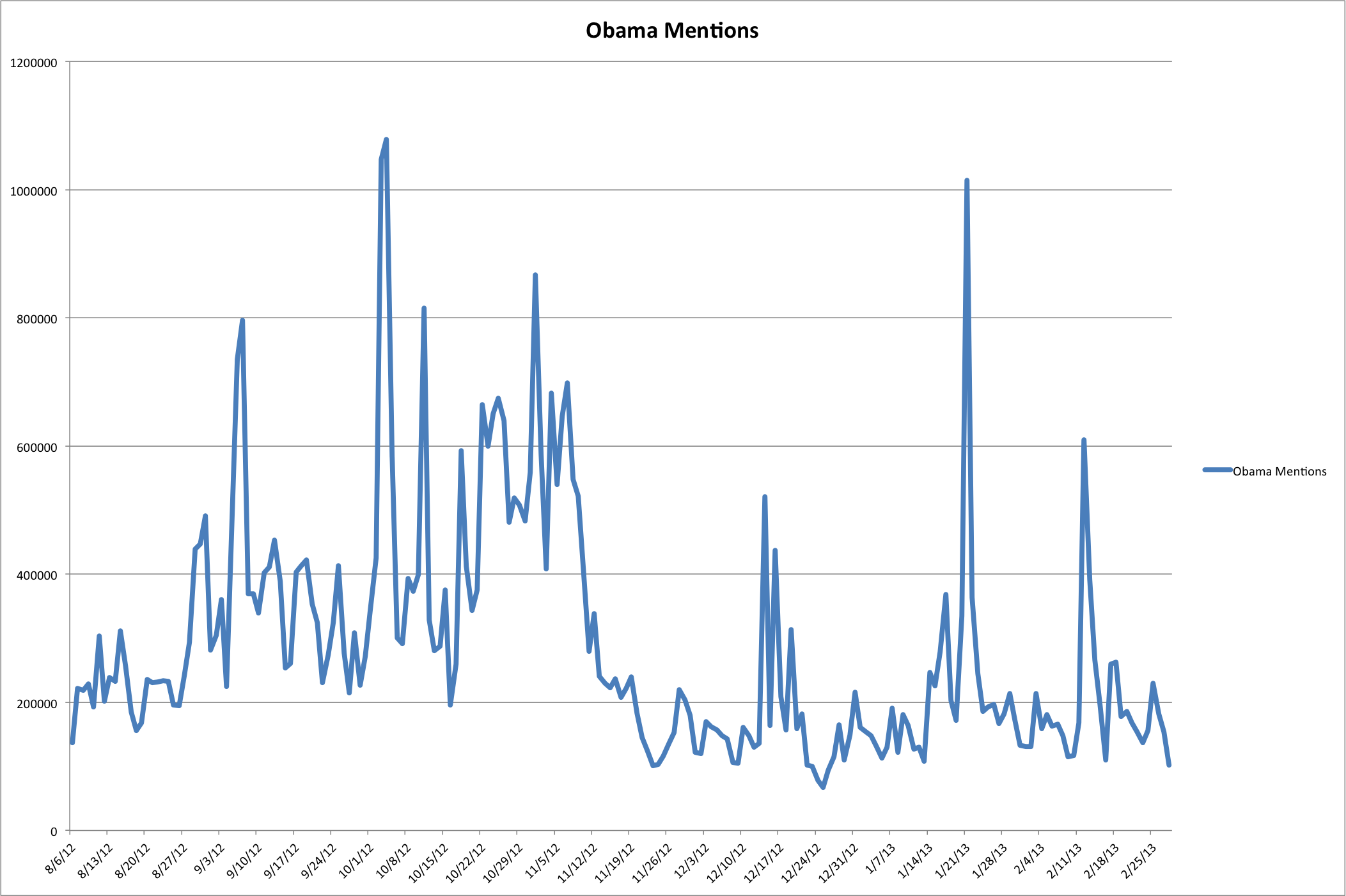
Click to Enlarge
Some caveats: (1) during election night and a couple of the debates, Twitter’s API couldn’t keep up with the volume of tweets, and so my counts are too low. (2) How you define your search affects the counts. My search is somewhat narrow, and so that also will undercount tweets about the President.
During the inauguration, Obama got over a million mentions on Twitter. That’s an amazing number of people who took the time to write their thoughts (positive or negative) about the event and the man. Unless they were all about Michelle, of course…
You know, the big conservative push to hashtag all their tweets about the State of the Union speech so people can see the massive disdain on social media?
Yeah, well, here it is:
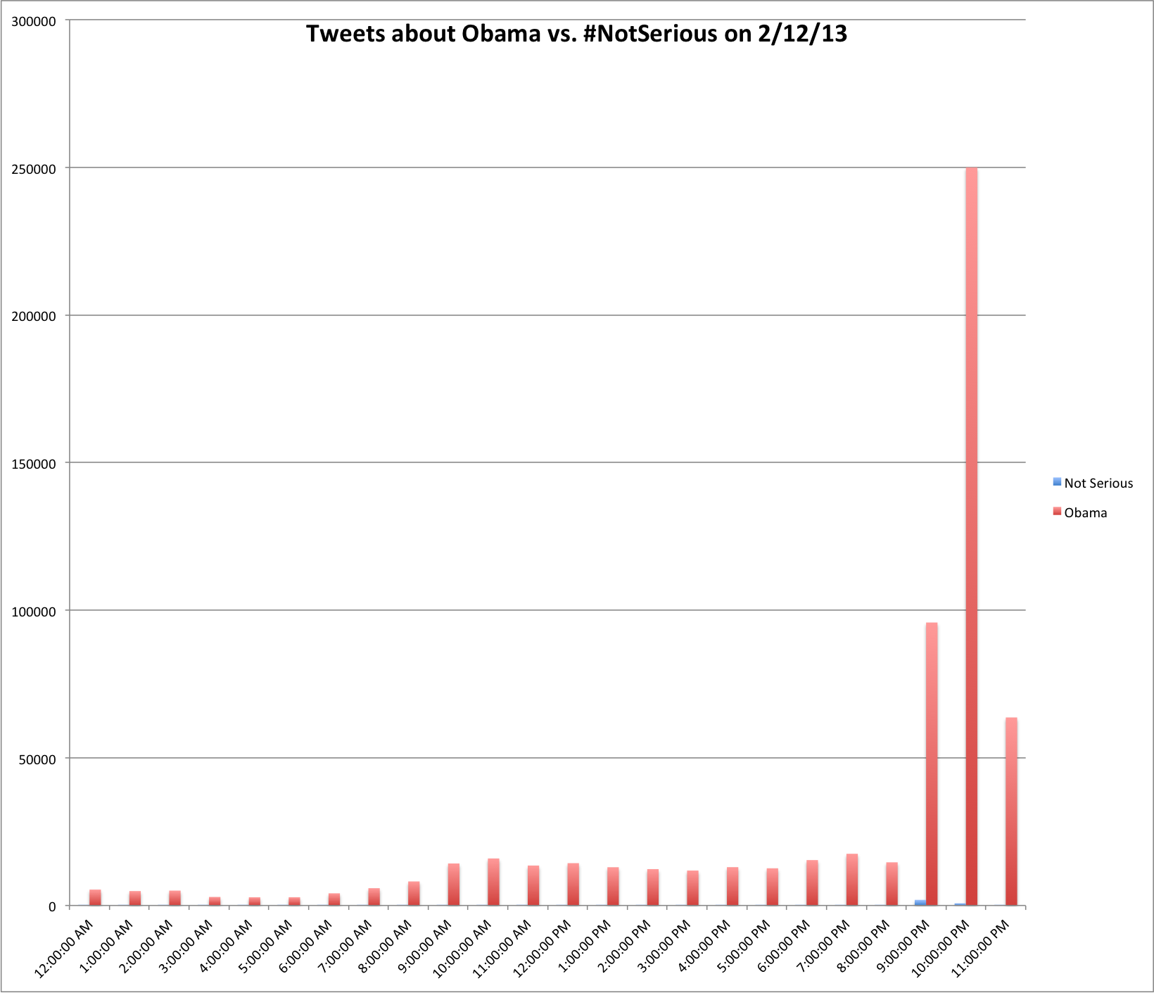
Oh dear. are they in there? Maybe a percentage plot:
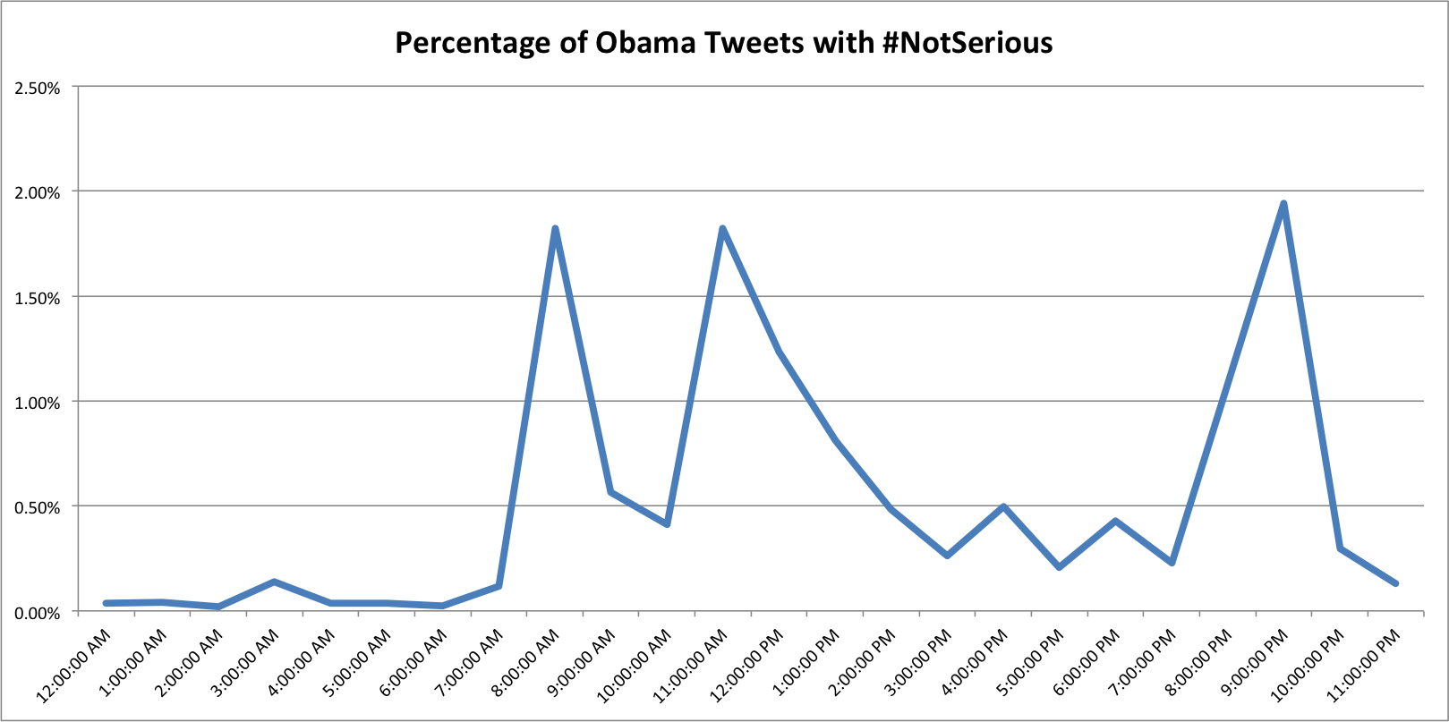
It would be ironic if, in total for the day, the number of #NotSerious tweets were 1% of all the tweets about Obama. But, alas, they only made it to 0.65%…
Yesterday I received an email fundraising pitch from Obama’s new Organizing for America:
Looks safe … click to enlarge
At the bottom of the email is a link to click to :
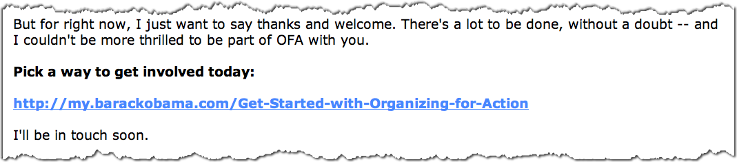
Nothing there to worry about, right?
But the text you see is not the actual link that is in the email. That link is really:
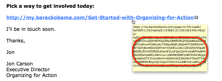
Doesn’t look like humans can read it, does it?
There’s a lot of information in that link, most of which does not appear to be human readable. It turns out that it is encoded using a very common system known as “Base 64”, which is a way to take a bunch of data and put it into a URL like this. But there’s no magic to Base 64, and when you decode it you see:
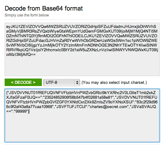
Hey, that’s me!
I’ve replaced my email address (to @secret.com) and zip code (with 99999), however if you are sufficiently energetic you can type in the base 64 text and see what it really is…
Anyone else I share that link with, when they click it, will be taken to the Organizing for Action page and shown my email address and zip code.
Other people appear to have their email address and zip codes exposed clearly in the links they’ve shared on Twitter:
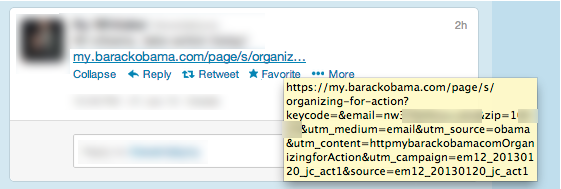
Identifying information blurred by me…
It’s not a terrible security breach, and I’ve only found about 30 or so people who’ve accidentally done this in the past week. But given that the OFA web site holds credit card information, the leaked data represents two pieces of personally identifiable information that could theoretically be used to assist in identity theft. And if you share such links on Twitter you may find that people who oppose your views find it an opportune time to start up an email conversation you did not solicit…
Regardless of the risk, I am fairly certain (just about all of) the people involved did not intend to publicize their email addresses and home zip codes on Twitter.